
A Dashboard That Starts Simple
Moneyta's dashboard now opens in a Basic view: your balance, the chart, your holdings, and what needs attention. The full terminal is one toggle away. Why we split it, what stayed, and the design rule that now runs through every screen.

The most consistent feedback from our beta members was not about a number or a feature. It was about density: the dashboard answered twenty questions at once when most visits ask only one. How am I doing?
So the dashboard now has two views. Basic opens with your balance in large type, the change today, your Moneyta Score grade as one tappable chip, a clean chart with period pills, your top holdings as flat rows, and the two or three observations most worth your attention. That is the whole screen. No tables inside cards inside panels.
Advanced is the screen you already know, pixel for pixel: every panel, every table, the full terminal. Nothing was removed from it. The toggle sits at the top of the page, your choice persists across devices, and there is an explicit default in Account settings. New members start in Basic; existing members keep Advanced until they choose otherwise, because nobody's screen should change under them.
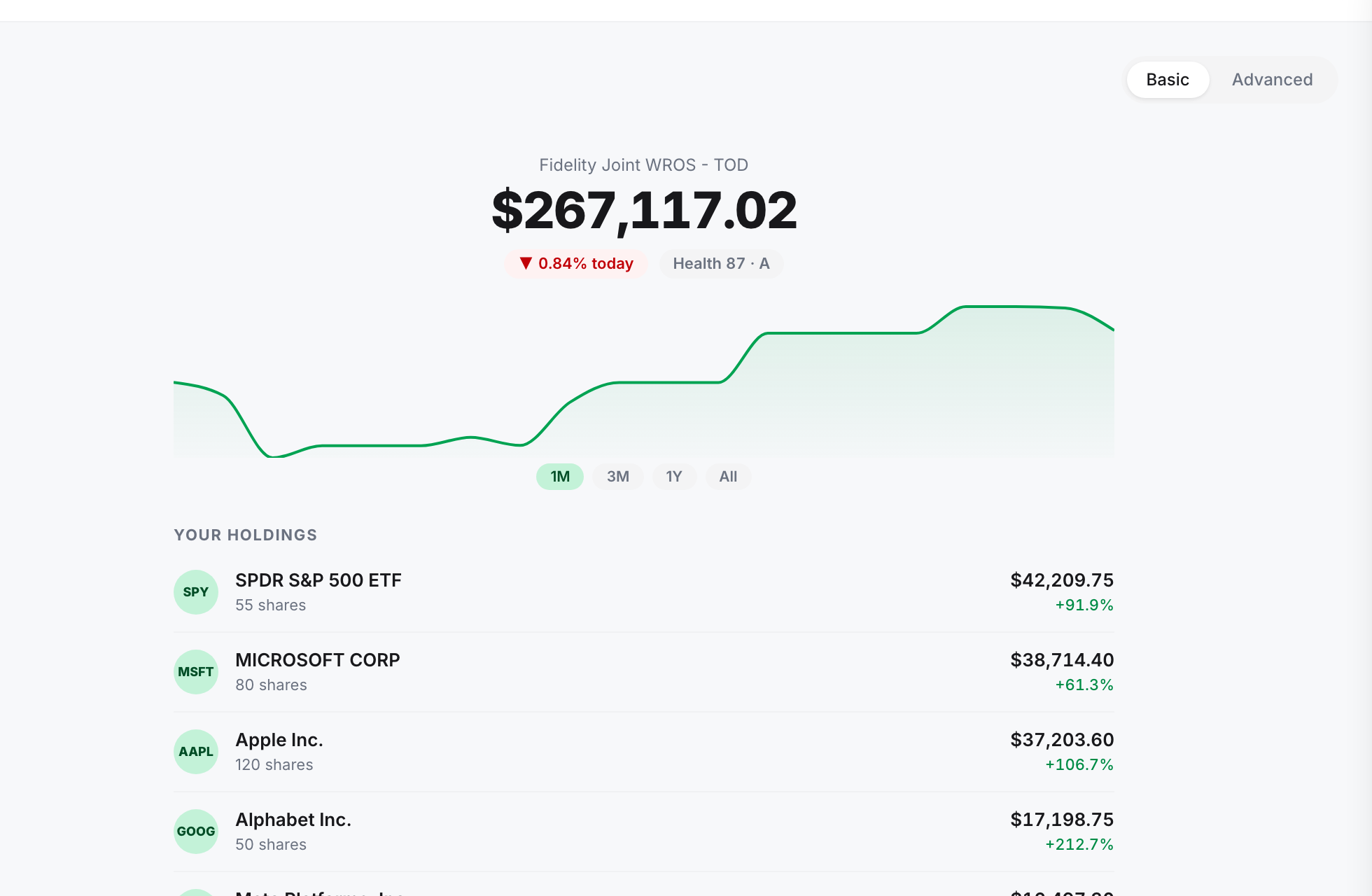
What deliberately stayed in both views
- Data-integrity prompts. If your cost basis needs attention or an analysis has gone stale, both views say so. Simple never means quiet about problems.
- The same numbers. Basic is a smaller window onto the same analysis, never a rounded-off version of it.
- The Moneyta Score, one tap from its full explanation: the walkthrough shows the steps with your own numbers substituted in.
The same rule, applied to research
The research screens got the same pass. What is yours leads: the filings news on stocks you hold or follow opens the page, capped at the five most active with the rest one tap away. The market-wide charts, what all institutions bought and sold, breadth, the largest managers, now sit behind a single closed-by-default section. They are one click away, not a wall you scroll past.
And one small honesty fix worth mentioning: the price chart on a stock page now shows dollars when you are looking at one stock, and switches to percent only when you overlay the S&P 500, where a common scale is the only fair way to draw two lines on one axis.
Frequently asked questions
Did the Advanced dashboard lose anything?
No. Advanced is the previous dashboard unchanged. Basic is a curated subset, and the toggle switches instantly.
Which view will I see first?
New members start in Basic. Existing members keep Advanced until they choose otherwise, on the dashboard itself or in Account settings.